FarMart Dashak
Branding for FarMart's 10-year anniversary: one identity for a two-day celebration, from ten-year walls to trophies.
FarMart Dashak was FarMart's tenth anniversary, a two-day, company-wide celebration. Day one was Sports Day; day two was the main anniversary function. Together with Akshay Sharma and Anjali Choudhary, I worked on the event's branding and visual design, taking one identity from ten-year walls and stage backdrops all the way down to certificates, trophies and mementos.
Sports Day
EnergeticSports, team activities and employee participation, with its own sports awards.
Main function
PolishedThe formal ten-year celebration: FarMart's journey, recognition and awards.
The identity needed to:
- Celebrate the ten-year milestone
- Work across both days of the event
- Feel energetic for Sports Day and polished for the main function
- Stay consistent across printed and physical materials
- Scale from a large wall down to a certificate or trophy
A complete branded experience, not a collection of event assets.
I started by mapping what each day needed: the activities, the tone, and the awards. That showed where the identity had to stay fixed and where it could flex for the context.
I worked with FarMart's marketing and event teams throughout, from understanding requirements and exploring directions to incorporating feedback and preparing final files for production.
The same visual language had to hold up across very different formats, each seen at a different distance:
- 10-year wallsSeen from across the venue
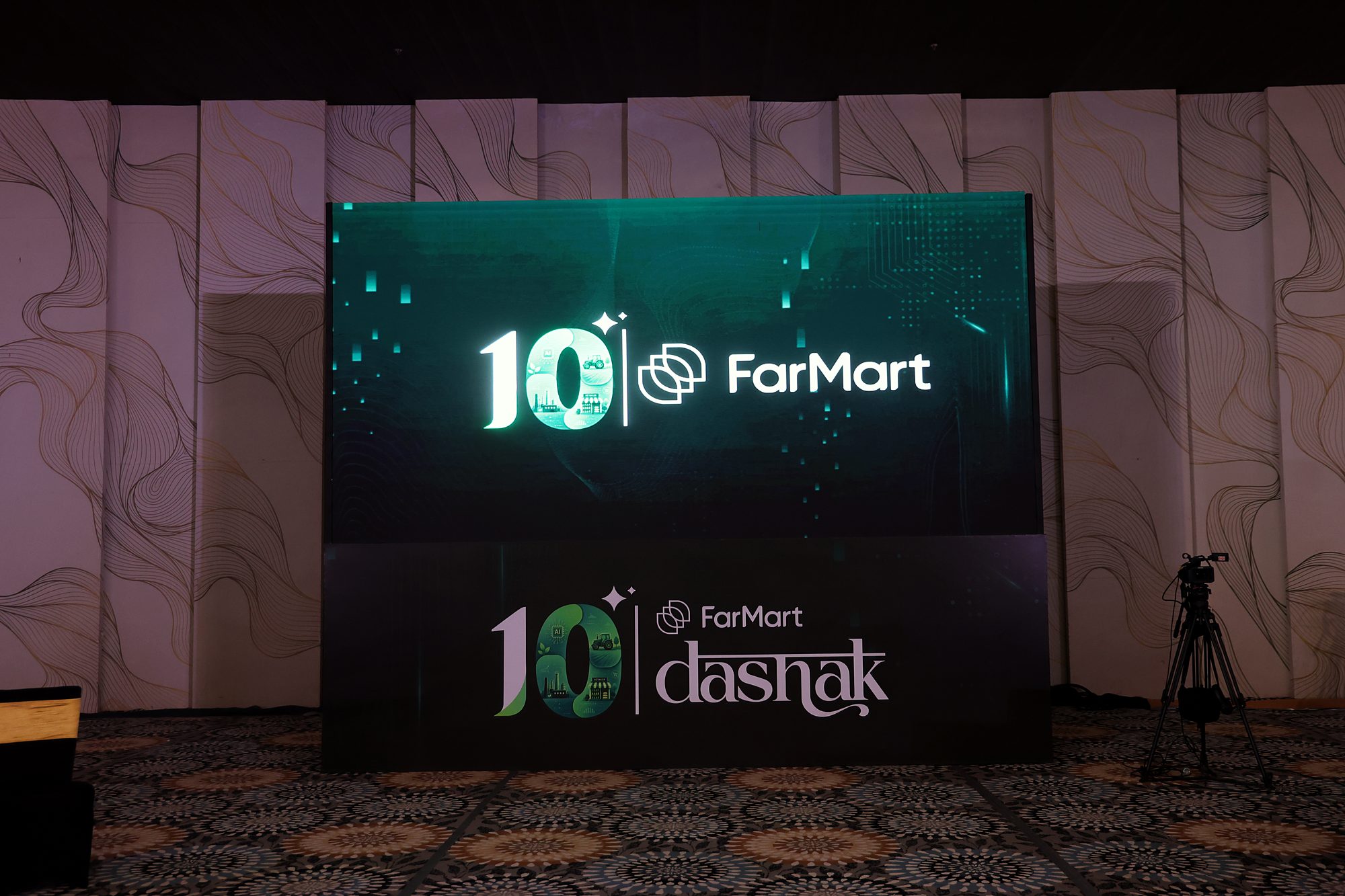
- Backdrops and stageRead in photos and from the audience
- Flags and venue brandingGlimpsed while moving through the space
- Event printablesPicked up and read
- CertificatesRead up close, kept
- TrophiesHeld, photographed
- MementosTaken home
Large-format pieces had to work from a distance, while certificates, trophies and mementos needed finer, more refined detail. Everything was designed in Figma with physical production in mind.
- 01
Make “10 Years” the hero
The milestone became the central visual element and the common thread connecting every asset and both days.
- 02
One identity, two experiences
Instead of separate branding for each day, a shared system that adapts, so the days feel connected while keeping their own character.
- 03
Take the identity off the wall
The branding extended into certificates, trophies and mementos, so the identity became something employees could take home.
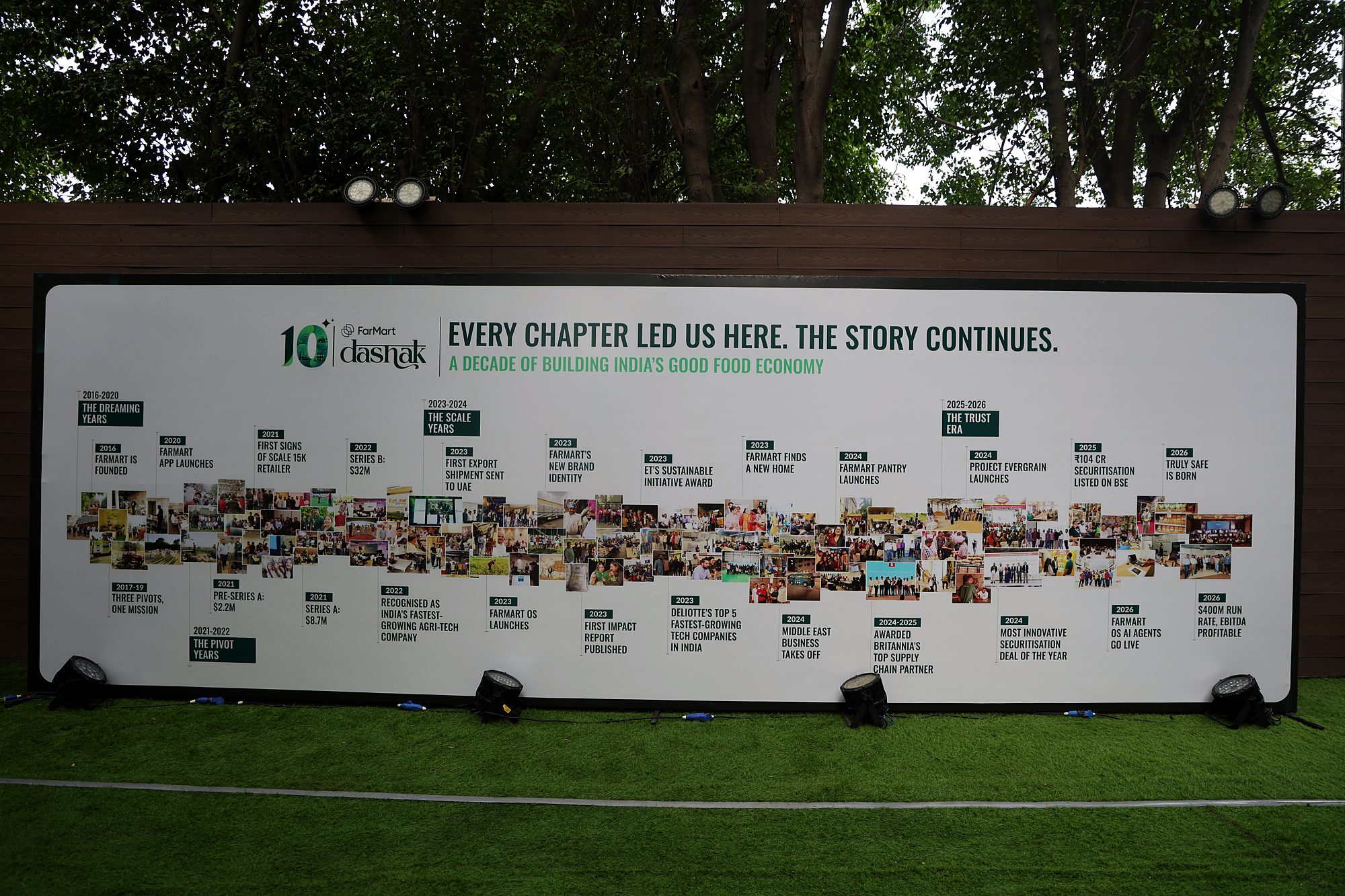
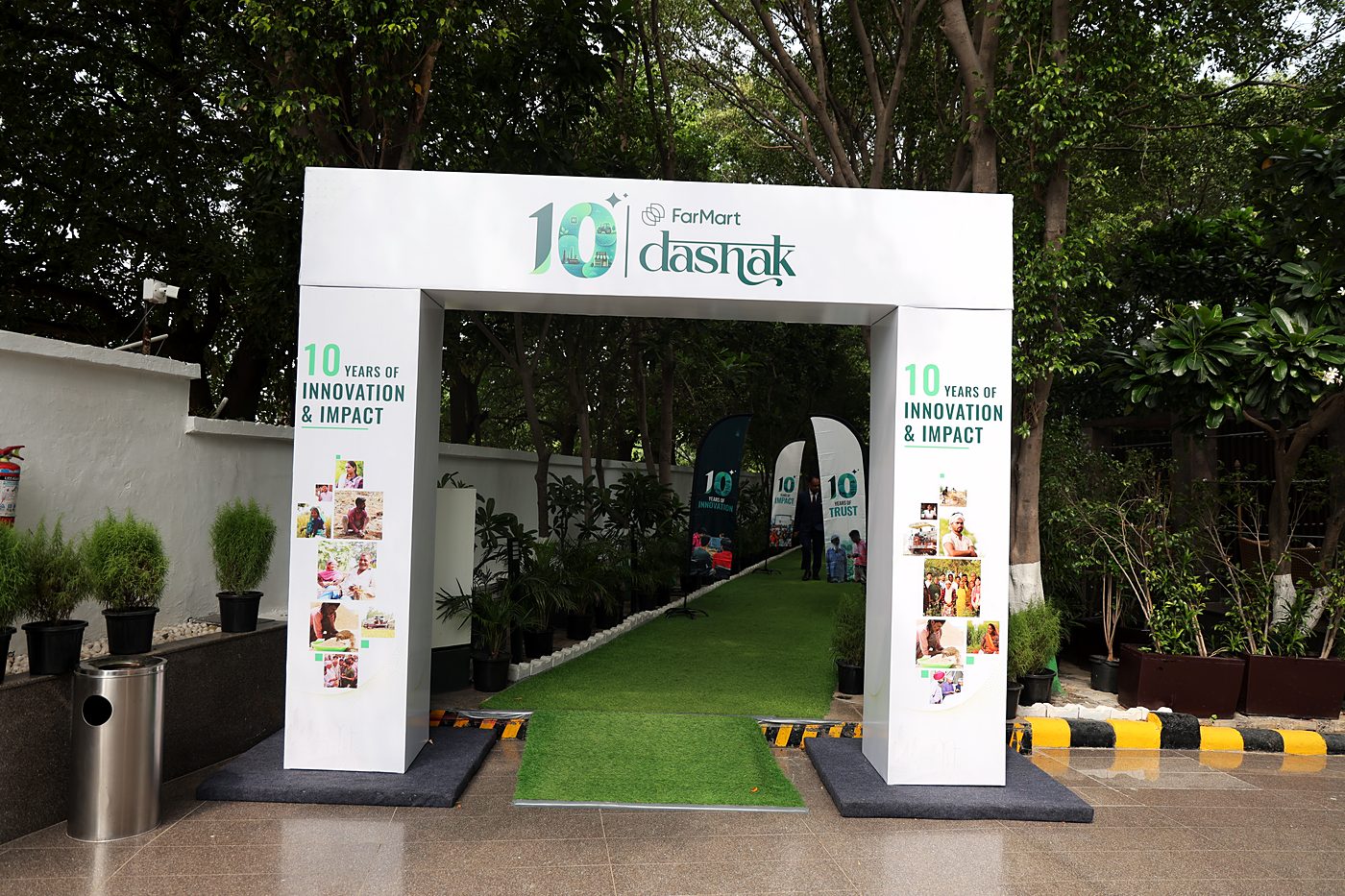

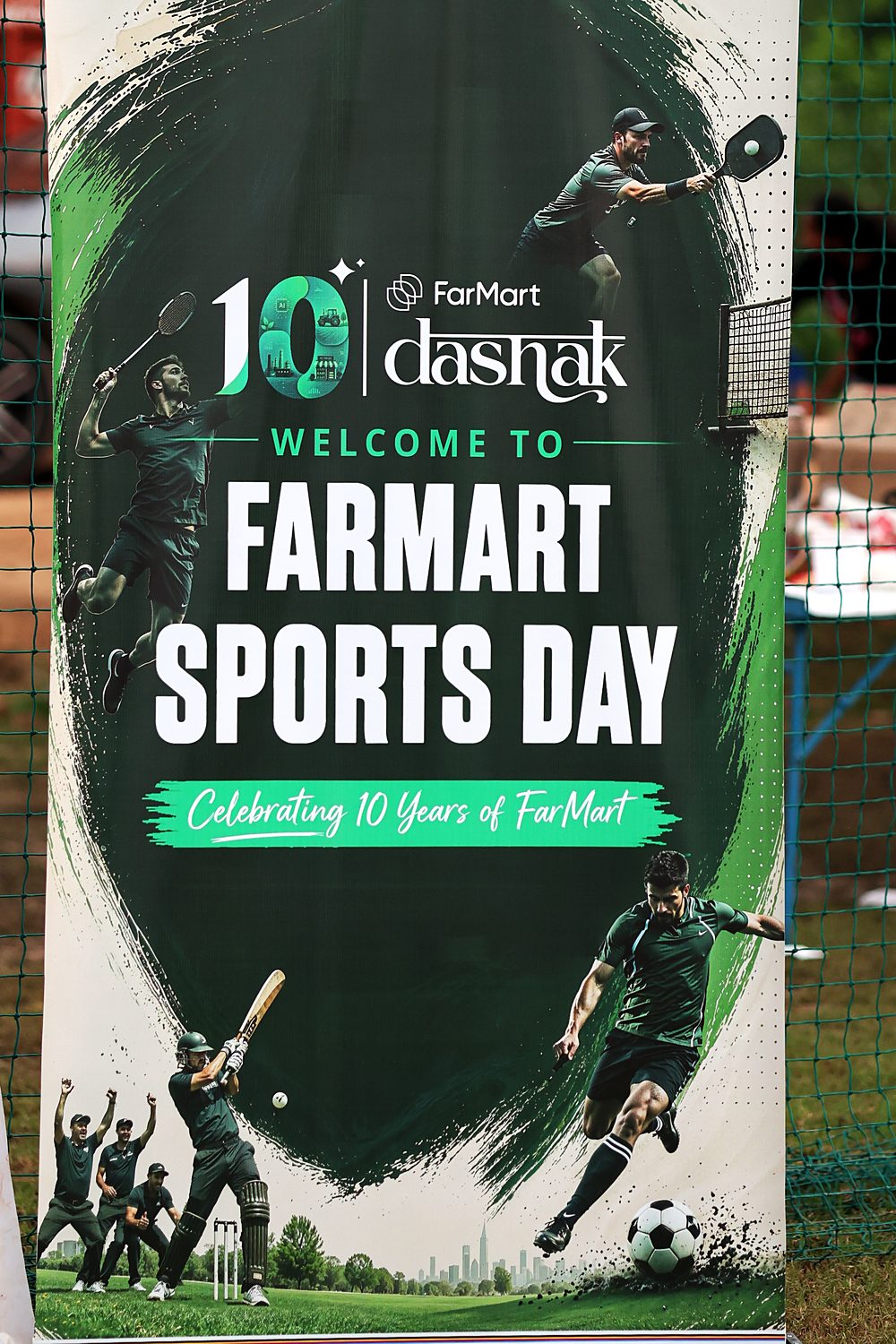
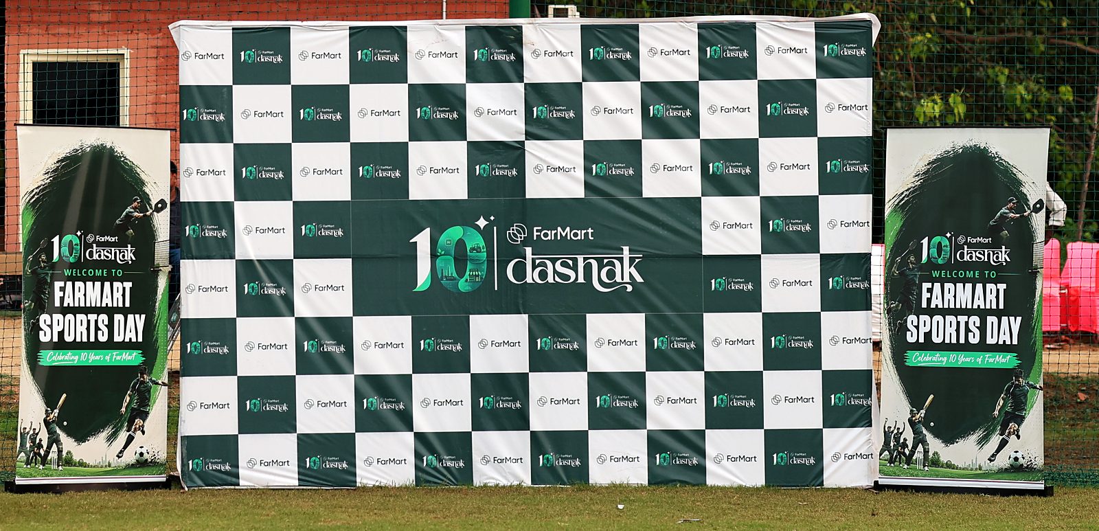
- Outdoors, the identity turned energetic: deep green, brushstroke textures and athletes in motion.
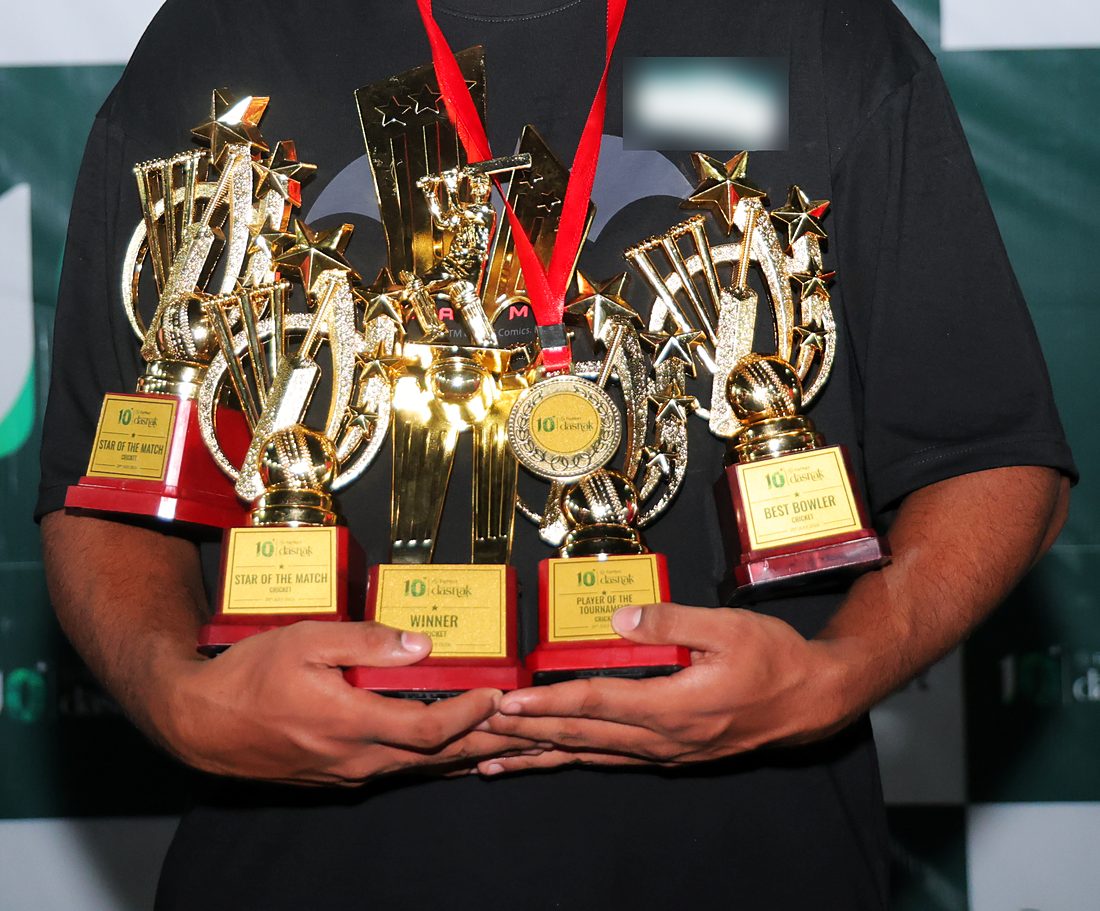
- The same lockup sat on every trophy plaque and medal, from Star of the Match to Best Bowler.
- Winners took the identity home, which is exactly what the physical pieces were for.
Sports Day: the roll-up at the ground, and the trophies it led to.
The branding ran across both days of the celebration, with one visual language across:
- 10-year walls
- Backdrops
- Flags
- Certificates
- Trophies
- Mementos
- Event printables
- On-ground branding
- Event creatives
- Roll-up banners
- Step-and-repeat backdrop
- Stage screens
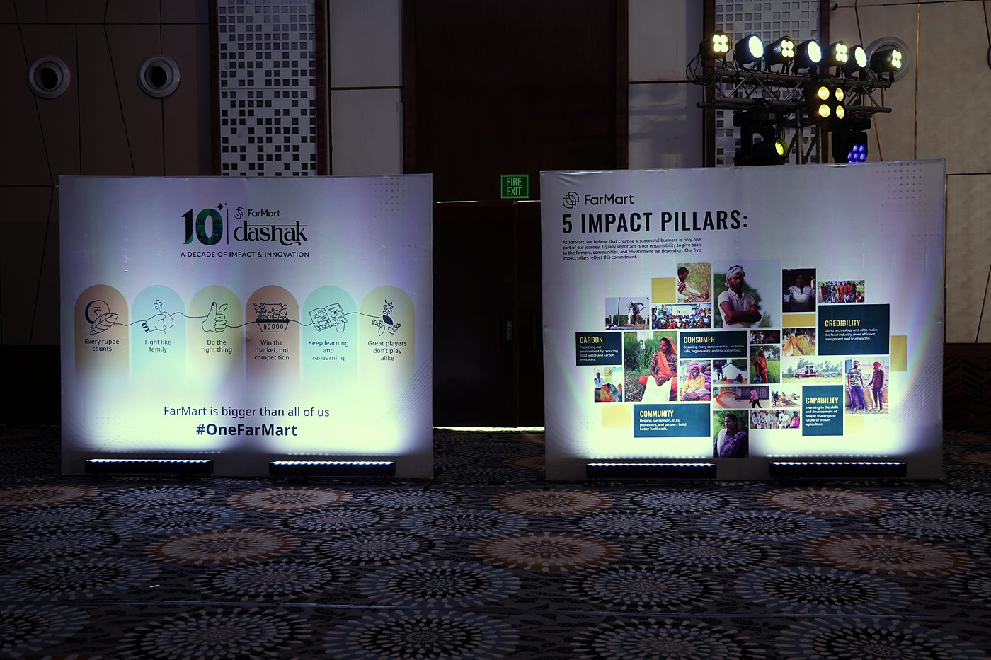
- Values and impact boards
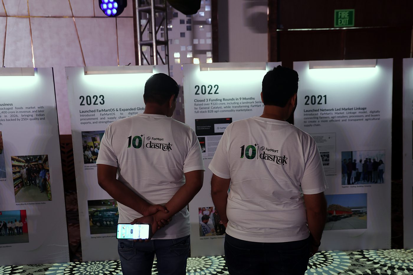
- Timeline boards
- T-shirts
Designed with:
Working with FarMart's marketing and event teams.
Designing beyond the screen. Physical production meant thinking about viewing distance, scale and the object in someone's hand, not just a frame in Figma.